Purple
#7C3AEDRarity, distinction, depth, clarity, and strategic vision — set in a modern technological context.
Modern. Professional. Trustworthy.
Our visual identity reflects an enterprise approach centered on structuring data, simplifying complexity, and driving innovation through continuous, methodical development.
Each shade in our palette carries deliberate meaning — together they form a balanced visual language of depth, precision, clarity, and operational agility.
Rarity, distinction, depth, clarity, and strategic vision — set in a modern technological context.
Precision, solidity, and technical rigor — the structural foundation of every system.
Clarity, purity, and renewed beginnings — the open canvas where ideas are made visible.
Balance, neutral professionalism, and technical agility — the connective tissue that holds the system in equilibrium.
Clean, modern fonts that ensure readability and professional appearance.
Heading 1
Heading 2
Heading 3
Body Text
Building intelligent, scalable digital solutions grounded in trust and responsible innovation.
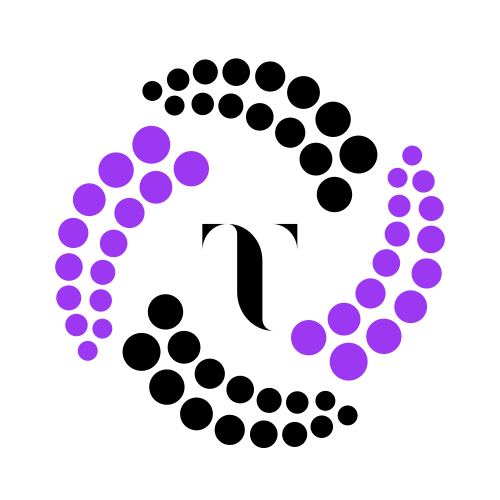
The logo originates from a network of approximately 60 dispersed points, representing data in its raw state. These elements gradually converge to form the letter T — a symbol of Trust — embodying our commitment to building clear, interconnected, and scalable systems.
Sixty is no accident: it is the root of calculation and geometry, derived from the ancient Babylonian sexagesimal system that still governs how we measure time, angles, and orbits. By anchoring our identity in 60 converging points, we connect modern data engineering to one of the oldest, most resilient mathematical structures ever devised — a quiet acknowledgment that true innovation builds on enduring foundations.